How Data Visualization Can Improve Your Business
Your business depends on good decision-making. Whether the people in charge of decisions are executives, managers, or yourself, you need visualized information that can help you make better decisions, cut costs, and save more money while providing the same excellent services and/or products to your customers.
Benefits of Data Visualization

Data visualization allows anyone to easily look at and understand data. As a result, data can help business owners make better choices that lead to increased profits while allowing managers to make the right decisions for their departments.
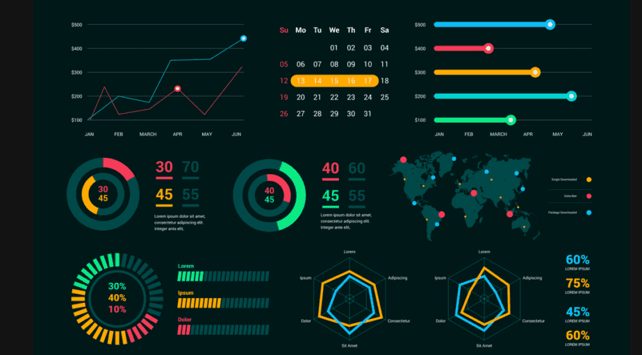
Unfortunately, data isn’t always as easy to sort and sift through as you need it to be. Data visualization takes boring data and gives you graphs and charts that can help you understand information. Here’s how data visualization can improve your business.
Improves Decision Making
Data visualization allows you to configure your data so it’s easier to analyze different pieces of information, allowing analysts to learn more. With the right background information, you can make better decisions at all levels of your business. Data visualization makes it easier to identify bottlenecks and business problems alongside successes.
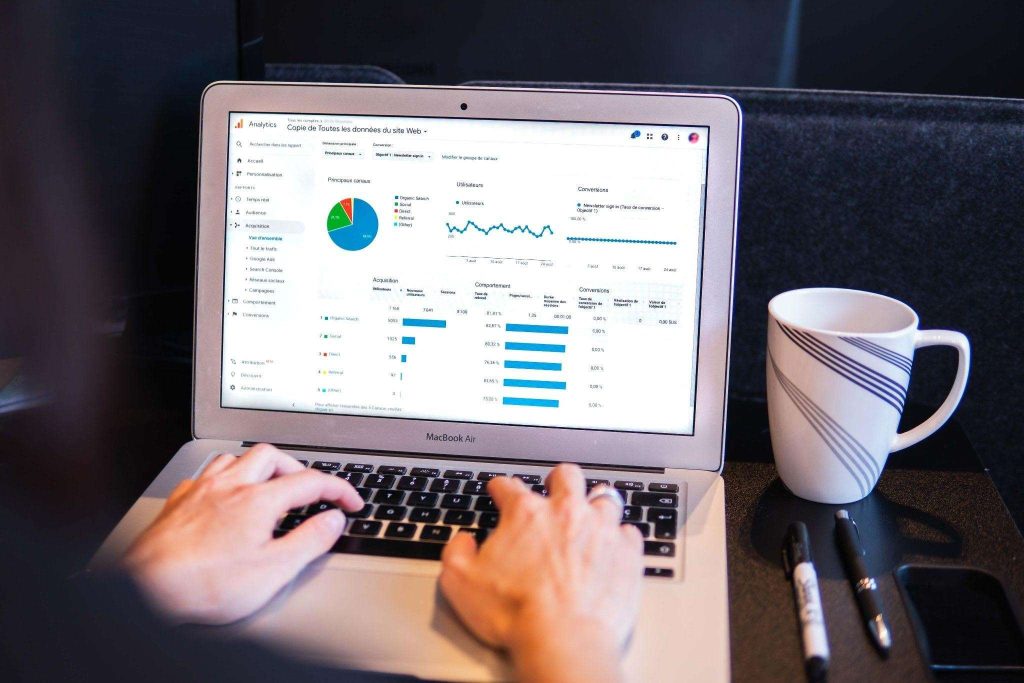
For example, you can use data to find out which areas of your website need improvement. While you can dig deep into Google Analytics, you can also create data visualization in a dashboard that allows you to see everything laid out with easy-to-understand images. You can filter that data by the number of page views or conversions on pages to uncover the least successful web pages and make changes.
You can use data in any department. For example, the accounting department can visualize data that will tell them what areas of your business cost the most money and why. Then, using tools like professional tax software can help you understand how to cut costs and where to spend more.
Better Absorption
Visualizing data makes it more likely to be absorbed by more individuals, allowing us to understand large volumes of information within just a few seconds. It’s easier for the brain to process images than it is numbers or words on a page. Images allow us to create connections between data and context easily and without worrying about crunching numbers.
For example, you can find out how many employee background checks you run in a month to discover how to save money on the hiring and recruitment process.
Accelerated Responses
Business tools, including data visualization, enhance presentations and reports, allowing people reading the reports to absorb the necessary information and quickly find issues. Data allows individuals to propose logical actions with better efficiency than before because sifting through the data takes less time. Data visualization can also help more individuals, regardless of their skill set, clearly understand data.
Simplicity
Data visualization makes organizing and understanding data easier and more straightforward than before. Compared with contextual information, visualizations, such as charts and graphs can help analysts see the big picture and effectively analyze everything at once. Data can also be filtered so analysts can focus on one area of the business or another.
Simplicity leads to better business decision-making because it allows you to make the best conclusions. For example, an analyst could see a chart of the U.S. and determine that nobody in Kentucky purchased their products because they’re not spending enough on advertising in that region.
Easier to See Trends

Seeing trends when you have a bunch of numbers in front of you is difficult without visualization. By turning numbers into charts, you can easily see trends and patterns that can affect your bottom line.
Visualization allows you to find the information you need most and quickly understand it. For example, if you run a business, you may find that most of your profits take place from clients in the city rather than the suburbs. In this example, an analyst can draw many conclusions based on the data. In this case, the analyst may suggest investing more money in advertising in a particular geographical area.
Real-time Insights
Data visualization can provide you with real-time insights on anything you collect data for. For example, you can monitor your employees’ productivity, check your sales, and find out where your customers are coming from with the click of a few buttons.
Not only that, but real-time insights can help you see what’s happening with your business at any point of the day. Data can tell you when shoppers are more likely to purchase your products so you can take the right steps to support their needs during that time, including having more employees available to answer questions.
Improved Collaboration
Data visualization can help improve collaboration among departments because you can easily communicate important information across departments and teams with the same level of clarity. Allowing everyone to visualize data keeps everyone on the same page to make decisions accurately and efficiently.
Enhanced Engagement
Relating to data is easier when it comes in the form of visual presentation. Images are not only easier to digest, but they create emotional responses. Paired with an easy-to-understand chart that can be filtered, data can help drive opinions and actions based on valuable insights.
Data is used during presentations to showcase strength, but a visual representation of the data can help build credibility and persuade others because it doesn’t take as much work from their brains to understand images and charts as it does numbers on a spreadsheet.
More Persuasive
As we’ve already mentioned, data that’s visualized is easier to interpret and understand, but it’s also more persuasive. Visualizing data allows people to make decisions faster, which can be more compelling than the numbers on a spreadsheet. In addition, because visualization allows you to organize data however you’d like, you can use real numbers to help others form opinions or persuade them to think a certain way.
For example, suppose you have data about recent marketing straightforward campaigns. In this case, you could showcase the cost for the campaign, sales generated, leads generated, and other information about your customers, including their demographics.
By filtering this data by a particular group, such as customers’ ages, you can uncover ways to better market to your customers. Maybe you thought your customers were Millennials, only to find out they’re more straightforward and older. With data, you can visualize this information in just a few seconds and come up with solutions faster.


